Since 2018, the Open Data Information Service Berlin (ODIS) has been accompanying our city on its path to an open, sustainable, and data-driven society, focusing on the provision and use of open data. In our column, each team member shares their work experiences along the stages of the Open Data Journey, offering intriguing insights into their projects—including a few behind-the-scenes stories!

Data Visualization – Qu’est-ce que c’est?
The campfire lit, the mammoth hunted, hunger satisfied—once mere survival was secured, humans turned to visual communication. Much time has passed since the animal depictions in the Grotte von Lascaux, yet the need to visually communicate with fellow humans remains.
Today, data visualization is a form of representation akin to photography, illustration, or text. The infographic presents the golden rule of data visualization that accompanied me throughout my interface studies. It elegantly answers the what, how, and why questions of data visualization.
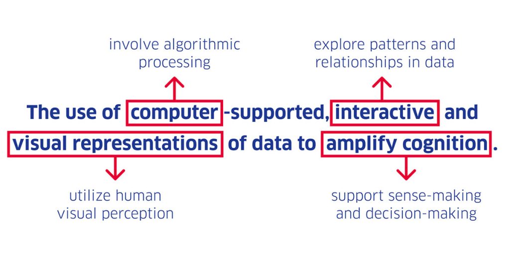
In a successful data visualization, representation and interaction merge into a compelling user experience. People can be guided or explore to gain a broad overview of a topic, delve deeper through filtering, zooming, or dynamic queries and contextual information, or gain insights into historical data through time series. Data becomes tangible.
Visualizing Data – Gladly, but Why?
Data visualizations are not an end in themselves. As a medium, they are committed to societal relevance: “Public information should be made public. Information about our urban environment should be made understandable,” wrote R. S. Wurman, one of the godfathers of information design, back in the 1970s. Data visualization is also a matter of attitude.
When data visualizations are designed from a humanistic perspective (Data Humanism), an approach that centers on people, they serve a range of socially beneficial purposes:
- They enable data-based decision-making to enhance the common good.
- They lead to empowerment by making data more accessible.
- They convey insights that challenge existing opinions and encourage new perspectives on a problem.
- They promote effective science communication by reducing complexity.
- They allow for visual rather than textual information delivery, which can be processed more quickly—imagine an evacuation plan as text.
- They foster societal self-reflection by considering historical contexts and critically questioning one’s assumptions.
- They allow for self-determined data exploration, offering various viewpoints and perspectives, uncovering unseen relationships.
From my personal perspective, empowerment plays a crucial role today. When we at ODIS set out to open core datasets, we often refer to it internally as “liberating data.” Extensive texts and tables, imprisoned in PDF silos, are freed by us into an interactive form, making the data accessible, explorable, and interpretable for the urban community. Since we work in and for Berlin, urbanity is a focal point of our work, raising questions about the transformation of the city. In designing our prototypes, often in collaboration with other city stakeholders, we frequently ask ourselves how an interactive representation of urban data can promote transformative attitudes and practices among the city’s population and administration. Empowering the broader urban population hopefully leads to more opportunities for participation.
Hours for Seconds – Data Visualization Involves Much Teamwork and Effort
The widespread assumption that data speaks for itself is incorrect—it’s we, the data experts and designers, who must do so. Before raw data can become a beautiful data visualization, it must be curated, validated, integrated, enriched, structured, parsed, and cleaned. Data dumps are messy by nature, almost always containing inconsistencies, missing values, errors, duplicates, inaccuracies, and similar issues. Just as single-celled organisms once lived in a boundless ocean, we now exist surrounded by a sea of raw data. Sensors, private individuals, administrations, institutions, and companies—all contribute to this sea daily, increasing its volume. To create meaningful data visualizations from this data, interdisciplinary collaboration is essential, ideally handled by a team. Dataviz draws from diverse disciplines such as cartography, statistics, and interface design.
In our daily work, as an interdisciplinary team, we monitor what’s happening in Berlin’s Open Data sea and consider how we can help the city’s society navigate it more effectively. This means we spend a lot of time discussing, brainstorming, conceptualizing, sketching, programming, designing, discarding ideas, and redesigning. Iteration is an integral part of our process.
Making the Invisible Visible
Sometimes, data visualization is described as the art of making the invisible visible. At ODIS, we use several formats to practice this art.
With the Datenperlen project, we visualize topics like bicycle theft using classic dataviz formats, such as bar or doughnut charts. We all know bike theft happens, but we don’t see it. Here, dataviz helps uncover where and when particularly high numbers of bikes are stolen.
One of my favorite projects in cartography is the Berliner EnergieCheckpoint. On an interactive 3D map, users can explore the energy consumption of individual buildings and compare it to the consumption of an average five-person household. After all, who knows whether 2 million kWh/year is a lot or a little?
Kiezcolors is a project at the intersection of dataviz and art. Different types of land use in the city are color-coded and represented in a graphic tree diagram, which users can print as a postcard to send. The color scheme for this project was inspired by a music album. 🙂
Last but not least, we’ve also implemented projects in the field of data physicalization. For example, the card game ODIS Supertrumpf uses open city data and gamification to impart knowledge. Additionally, in collaboration with the Kiezlabor, we created Data Strings, an interactive project where passersby were invited to contribute data about their neighborhood using colorful strings.