Forms are one of the most important interfaces between citizens and the city administration. Whether you’re applying for a housing subsidy or registering a dog with city authorities, filling out (online) forms gives citizens access to numerous services that are essential for our everyday lives in Berlin.
It’s not always easy for citizens to fill out and submit government forms. Often these forms use language that is intuitive for government employees but practically unintelligible for laypeople. Additionally, they can be labor intensive to fill out, sometimes seeming to ask for the same information in multiple locations. Factors like these combine to create an overall negative user experience and give citizens a sense of stress or anxiety when it comes to filling out and submitting official forms.
Working with target users simplify online forms
In the fall of 2021, we launched the Digitalwerkstatt Verwaltung (“Digital Administration Workshop”) as a pilot project together with the Senate Department for the Interior, Digitalization and Sports (SenInnDS). The mission: to work with target users – i.e., everyday citizens – to make digital forms more user-friendly. Over multiple days the CityLAB and SenInnDS organized three digital workshops that saw 25 different Berliners (representing various walks of life) test out and evaluate three different government forms. Those forms were:
● Request for a copy of a marriage certificate
● Application for motor vehicle damage compensation
● Application to enroll a child in a different public school
Participants used an online Miro board to capture their observations and impressions – both positive and negative – of the forms and then discussed this feedback in small groups. Subsequently, our team analyzed and sorted the comments and the suggestions for improvement. This analysis provided the basis for further work to improve user-friendliness in forms and applications.
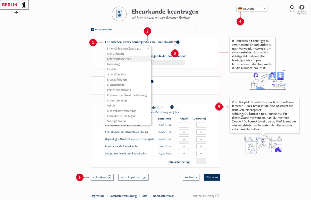
Prototype of a citizen-friendly marriage certificate
In June 2022, we collaborated with citizens once more to build on the results as part of the pop-up project Mall Anders.
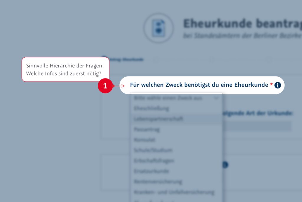
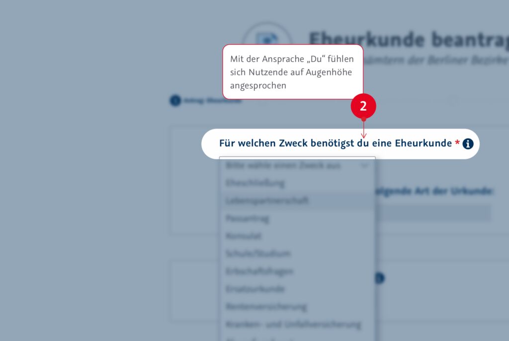
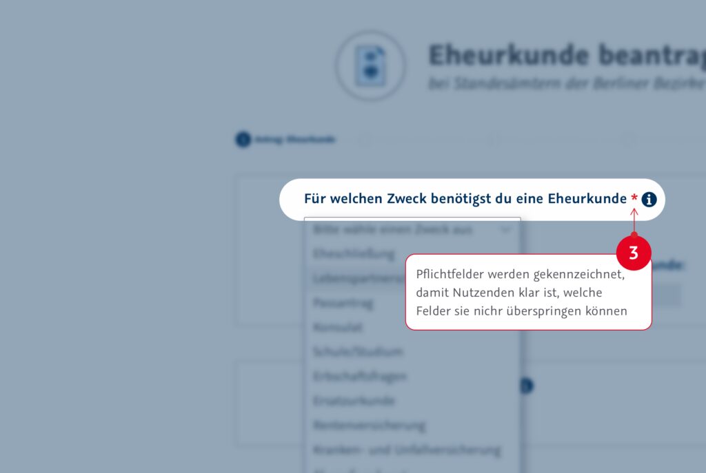
Based on the lessons learned from these two initiatives, we designed a “model” form that implements the numerous inputs we received from citizens on how to make government forms easier to use. In addition to some more specific suggestions for improvement, the model form also demonstrates a number of best-practice recommendations for the design of online forms in general. We’d like to share with you here the five most important insights gained from our conversations with citizens. In addition to our findings, this blogpost also contains image galleries that demonstrate how our model form applies these insights; the screenshots in the galleries highlight specific elements of the new application that aim to improve the user experience.
The goal of our project was to conduct a design study to gather ideas from the user’s perspective on how to make forms more accessible. We acknowledge, however, that we are ultimately presenting an idealized version of a form that isn’t necessarily able to be implemented in reality, at least not exactly as we have depicted it here – ultimately the city government is bound by various laws and regulations which limit its scope for action. Nevertheless, we hope the project can serve as an initiator for further discussions on how digital administrative services might be designed more from the user’s perspective in future.
Think from the perspective of users rather than administrators
One initial insight: forms should display input fields that are ordered and named in a way that is optimized for the user, not the government employees and workflows that will later process the submission. . Privacy statements should appear at the end of the form, for example: it can be overwhelming and confusing for users to be faced with a lengthy text asking for their consent to have their data processed before they even know what data they’re being asked to provide. Additionally, sometimes there are “exclusion questions” that determine whether an applicant even meets all the requirements to be able to submit the application in the first place. This type of question should always appear at the start of the form to avoid scenarios where citizens may have already gone through several steps before realizing that they’re not actually entitled to submit the application at all – an understandably frustrating experience.

Offer assistance throughout the process
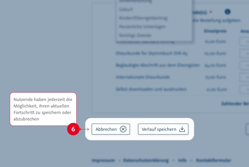
It isn’t always obvious to users what a certain term means or what input is expected in a particular field. Rephrasing can help here (e.g. instead of asking for a person’s name – potentially ambiguous, since there are different ways people might identify themselves – use “name as it appears on your ID card”), as can tooltips that define or clarify certain terms. Greater clarity is also achieved if the application provides clear-cut and transparent details of the costs involved: these should be indicated as early as possible in the application. A “shopping cart” view can help users keep track of how much they will be required to pay. Further, providing a simple overview of the application stages – including a graphic display of these stages after the application has been submitted – ensures that users always know exactly where they are in the overall process and what they can expect to happen next. And on the subject of costs: users are always happy to be presented with diverse and modern modes of payment, especially those that can be handled directly online.
Ensure greater efficiency through intelligent linkages
It can be frustrating for citizens to feel like they have to keep inputting the same information again and again. Digital applications should make it as easy as possible to transfer information from other sources to the application (e.g., the ability to transfer personal details from an existing service account profile or electronic ID card into the form). It’s also vital for users to have complete transparency and control over what data is shared and when. A so-called data opt-in is a good example here; this involves users giving the administration permission to share data depending on context.
Create mutual trust through explanations and transparency
The requirements for submitting an application are not always easy for users to understand: why exactly a specific document is needed in a particular format is rarely explained in a way that is comprehensible to end users. Explanations of certain steps and requirements – for example, through explanatory text next to certain fields – can help make things more transparent and reduce confusion and anxiety for end users.Additionally, users usually appreciate being addressed on an equal footing. This can be achieved by using a more informal type of address – such as first names rather than last names, for example. Setting the right tone for the entire interaction can help build more trust and understanding between the administration and citizens.
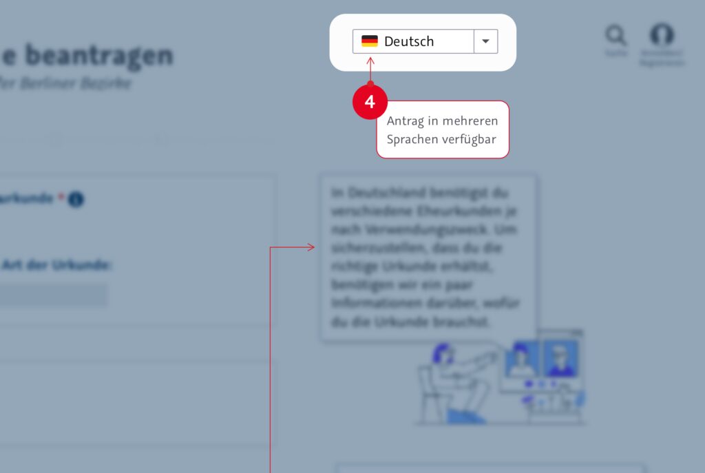
Reduce barriers through more accessible language
Two aspects are crucial when it comes to making the content of an application as accessible as possible: the provision of a form in multiple languages, and the usage of plain or simple language. In an international city like Berlin, there are many citizens who understand other languages better than German. Unfortunately, expecting the city government to make its forms available in dozens of languages through the power of automated translation is not realistic; government forms deploy a number of terms and phrasings that have specific legal meanings, so any translations would need a human to verify the accuracy of the translations. But translating forms into a handful of the most commonly spoken foreign languages would make citizen services much more accessible for a large number of Berliners. In addition to support for foreign languages, providing forms written in plain language and/or simple language would also significantly increase accessibility for large numbers of users. As mentioned above, administrative forms often use a particular type of official language that is difficult for laypeople to understand. Plan or simple language would allow the content of forms to be broken down to the essentials, creating greater clarity for users. Plain language and simple language are particularly helpful for people who have difficulty reading German for various reasons – aiding both native and non-native speakers of German.
Conclusion
Given the combination of legal requirements, technical options and diverse user needs, adapting and modernizing administrative forms is not something that can be done overnight. Nonetheless, thanks to the participation of citizens and partners from the Berlin administration, our design study illustrates what accessible, understandable government forms look like and how they could be implemented in the future.